The average checkout page has roughly a 2/3 abandonment rate. Yes, that means only one in three people who have already decided to make a purchase follow through. There may be several reasons buyers leave the checkout page, and I’m not saying the goal should be 100% conversion rate. But many websites have below average conversions on their checkout or signup forms/pages – and that means there is money left on the table.
Here are a few things to remember:
- Check out pages are not pricing pages: This means you don’t need to explain how the pricing of your products and services works. That was already taken care of on your super transparent pricing page!
- Less is better: Again, a checkout page is simply that so don’t add anything you don’t need in order to collect the payment.
- Keep it above the fold: Be serious about your ‘less is more’ approach and keep the entire form to one simple above the fold screen (for desktop).
- Mobile/touch optimized: If your form is not optimized for mobile, there’s a REALLY good chance your mobile abandonment rate is atrocious. Use drop down and buttons rather than asking mobile users to type.
- Left Aligned Drop Downs and Buttons: Try to keep the drop downs and other touch features aligned to the left of the screen. This makes it much easier for mobile users to tap the needed selections.
- Install Analytics: Be sure to create a success page and install analytics to your checkout and success pages so that you can track your optimization efforts.
Let’s Take a Look at a Form That Has Some Great Opportunities To Improve Conversion Rates
Take a look at this screenshot from a haunted attraction/event, Panic Point. What do you see can be improved?
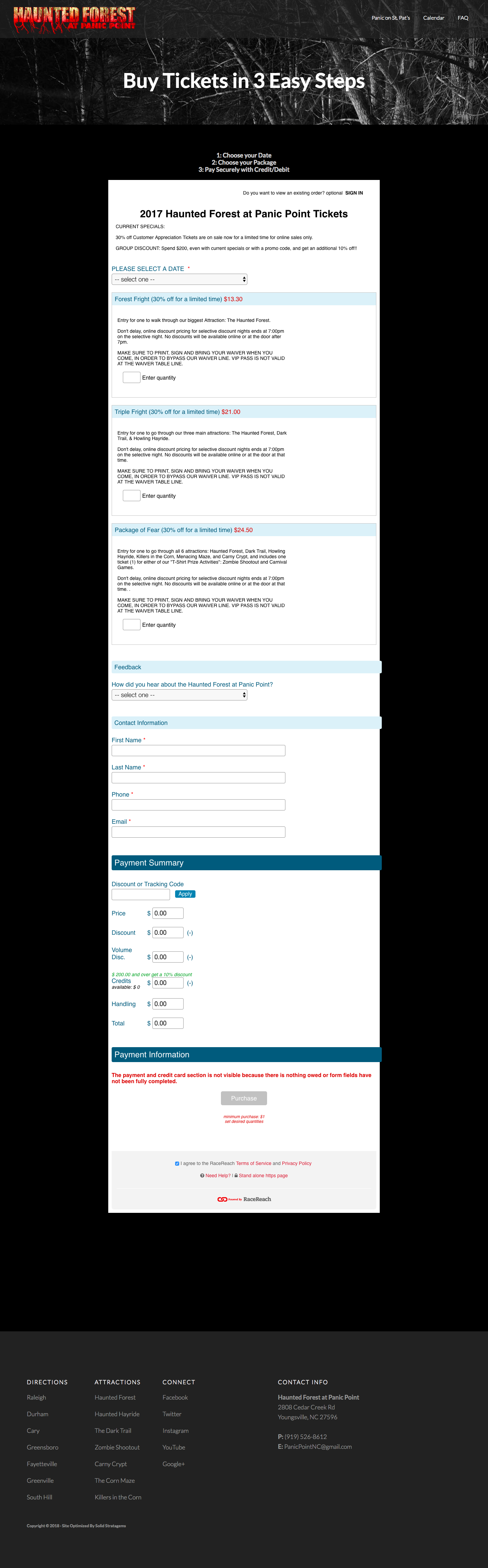
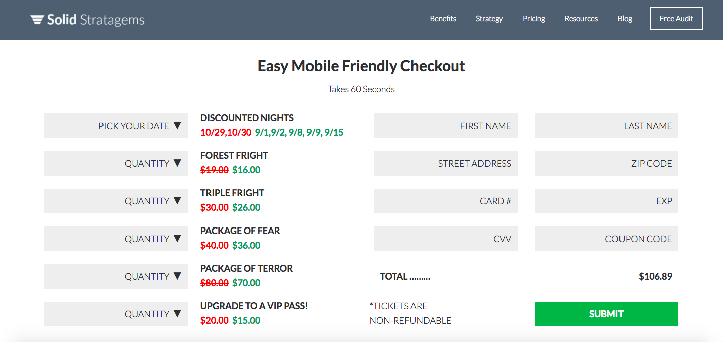
The form in the above image actually requires six screenshots from my laptop to view the entire form – and that doesn’t include the payment information that populates after you’ve selected your package. Using some of the tips above, let’s see if we can create a mobile-optimized form that fits on one screen.
↓ SAMPLE IMAGE ↓
↓ DESKTOP HTML ↓
Easy Mobile Friendly Checkout
Takes 60 Seconds
NON-REFUNDABLE
SAMPLE ENDS
Your Turn
What do you see in the improved form that can be even more optimized? Better yet, take a look at your forms, what can be improved there? Happy optimizing!
